A&P gives thumbs up to new WM welcome signs

A&P gives thumbs up to new WM welcome signs
Motorists will soon receive greetings when entering city from Memphis
news@theeveningtimes.com
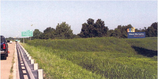
Soon, those driving their Chevy over the levee into the Gateway City of Arkansas will see fresh new welcome signs. The West Memphis Advertising and Promotion commissioners heard a consultant’s report, saw an illustration of the proposed sign proportionally imposed on top of both Interstate levees.
Upon seeing the mock-up, the board and authorized City Tourism Director Jim Jackson to move forward with two of the new signs.
The plan called for signs angled for inbound traffic on both Interstates 40 and 55 to clue travelers into the fact that they have entered the Wonder City. The monument- based sign will stand 12 feet high by 35 feet long, and feature the city’s signature “Gateway” logo as a light spectrum beam sweeps upward from the rectangular body of the sign reaching a 22-foot peak. Originally planned to be taller, the base height was set at a lower mark to reduce concerns over wind damage.
The message on the sign is short and sweet. After previous concerns had been voiced about a sign being too wordy and too hard to read the entire message at 65 miles per hour, the proposed sign board simply reads “West Memphis” in three-foot-high letters on the top line over an indented “Arkansas” in oneand- a-half-foot lettering.
The message is big enough for fast moving tourists to A&P
Continued from Page 1
take in 300 feet away, according to the analysis.
While the A& P had directed a bid for spotlights to shine on the sign from the ground, the consultants, Red Deluxe Brand Development, proposed otherwise. Jackson relayed the opinion to commissioners.
The consultants indicated an LED back-lit sign was state of the art and that spotlights on the ground were a tempting target for thieves and susceptible to mower damage.
“The pushed-through lettering is the industry standard,” reported Jackson.
“The old-school flood lights, they said, you just don’t want that.”
The plan showed white channeled lettering pushed through the sign board with the city and state name offset below in orange, drawn from the orange on the light spectrum on the Gateway logo. The dark blue background maximizes readability of the entire sign.
A& P commissioners were wowed with the presentation and the pictures and told Jackson to move ahead with just one change. Commissioners
offered succinct
feedback on to Jackson about the results of the welcome sign study.
“I think it’s marvelous,” said Councilwoman Ramona Taylor.
“You did awesome,” said Commissioner Troy Keeping. “ But what is with the gray in between the color bars? I think that should be removed. If it is for support, the support needs to be moved inside so it is not seen.”
Commissioners told Jackson to run with the proposal
but to hide the gray and get a materials list and estimated costs before asking for bids.

By John Rech


Share